After our three-part series in May, June, and July, you might be fatigued from reading about bathrooms. It might remind you of the time you were cornered by a co-worker at the office party who was droning on about his favorite fly-fishing spots, lures, and waders. You don't have to politely nod along with us and pray for a power outage. It's ok to check back next month. We understand.
At the risk of boring our readers with oh-another-bathroom-yawn-did-you-see-the-Bears-have-a-new-quarterback, we think the updated classic style of this bathroom turned out well. Although this bathroom presented a couple challenges, it led to one of our favorite results.
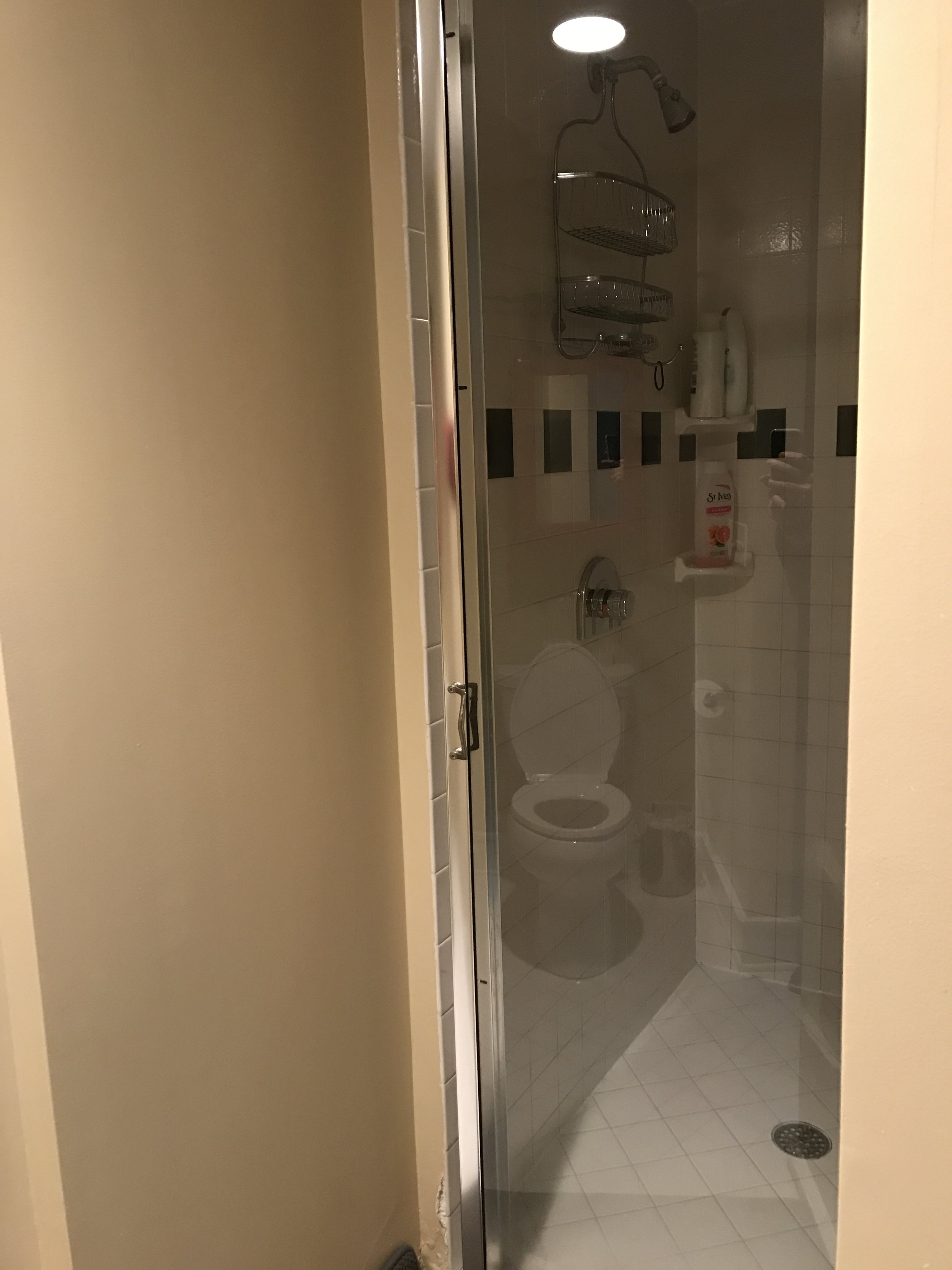
We started with an irregular layout and somewhat smaller than average footprint in which to hold a shower, separate tub, double-bowl vanity, and toilet. Two of the four walls were exterior walls, and there was no attractive opportunity to expand into the master bedroom. Second, the shower was raised due to the stairwell beneath it. A recessed medicine cabinet opposite the plumbing wall created a barrier between the vanity and shower; this was an instance where nine inches made an outsized difference. Removing this wall was the key to improving the feel and function of the shower.
As a side note, if you or anybody else makes reference to your "prison shower", it's probably time to consider an upgrade. That's no way to start your morning.
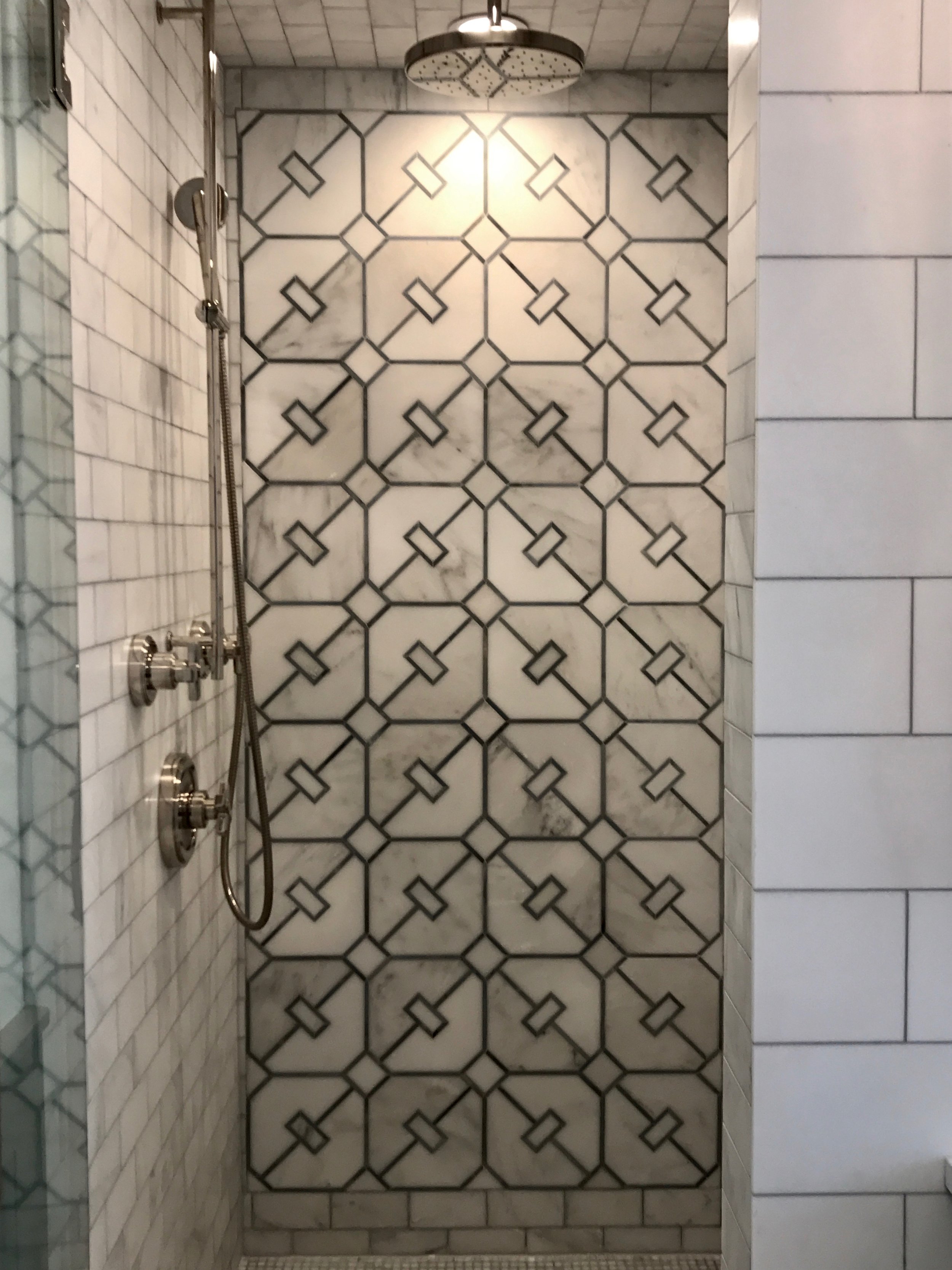
In addition to opening the shower, we installed an eye-catching tile on one wall and improved the lighting. Below is a closer look.
Asian Carrara tile with Cadet Blue geometric pattern. Nickel Silver Raindome by Laura Kirar for Kallista.
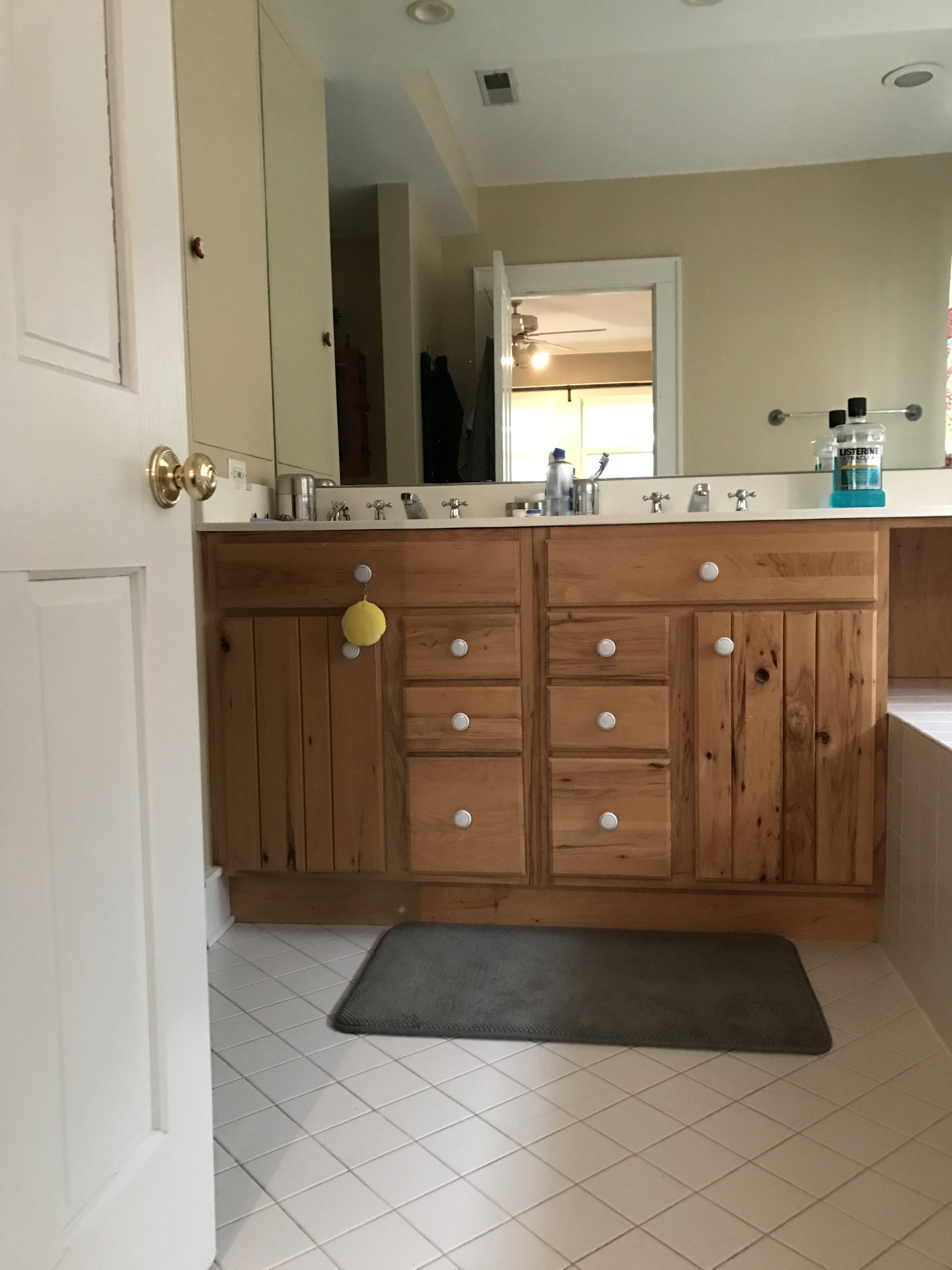
The existing country-style vanity, mirror, fixtures, and 4x4 ceramic floor tile were replaced with new cabinetry, pendant lights, medicine cabinets, plumbing, and tile.
The old tub was rarely used and created a dead zone next to the vanity.
The old tub with an unusable cavern at one end, covered by an unusable vanity top. Wasted space in this footprint was a big drawback.
The new tub and functional cabinetry. The country curtains were replaced with light-softening semi-opaque shades.
Custom skirt for tub deck, color matched to the vanity and wainscot on opposite wall, and a quartz deck surround.
We don't think there's anything ho-hum about this bathroom. The composition of materials and color in this compact bathroom sits well with us, and we're delighted to know that our client enjoys the bath regularly.
Of course there are challenges, and we owe a great debt to a trusting client who let us solve them with an eye towards enhancing the form and function. Around the time we dismantled the original bathroom, we walked past a mural that reminded us of what is possible.
A reminder when you encounter the small and irregular, among others.


