Furniture Guild

Brownout

Remember when some shade of brown was the default color in homes? Layers of brown, beige, and tan reigned supreme for at least a decade or two in recent history. Builders used them universally as the autopilot “neutral” decision. Dark wood furniture was widely available in home stores. The top-selling Benjamin Moore paint color in 2009 was Shaker Beige. Our client’s wanted to update their bathroom from brown to. . .

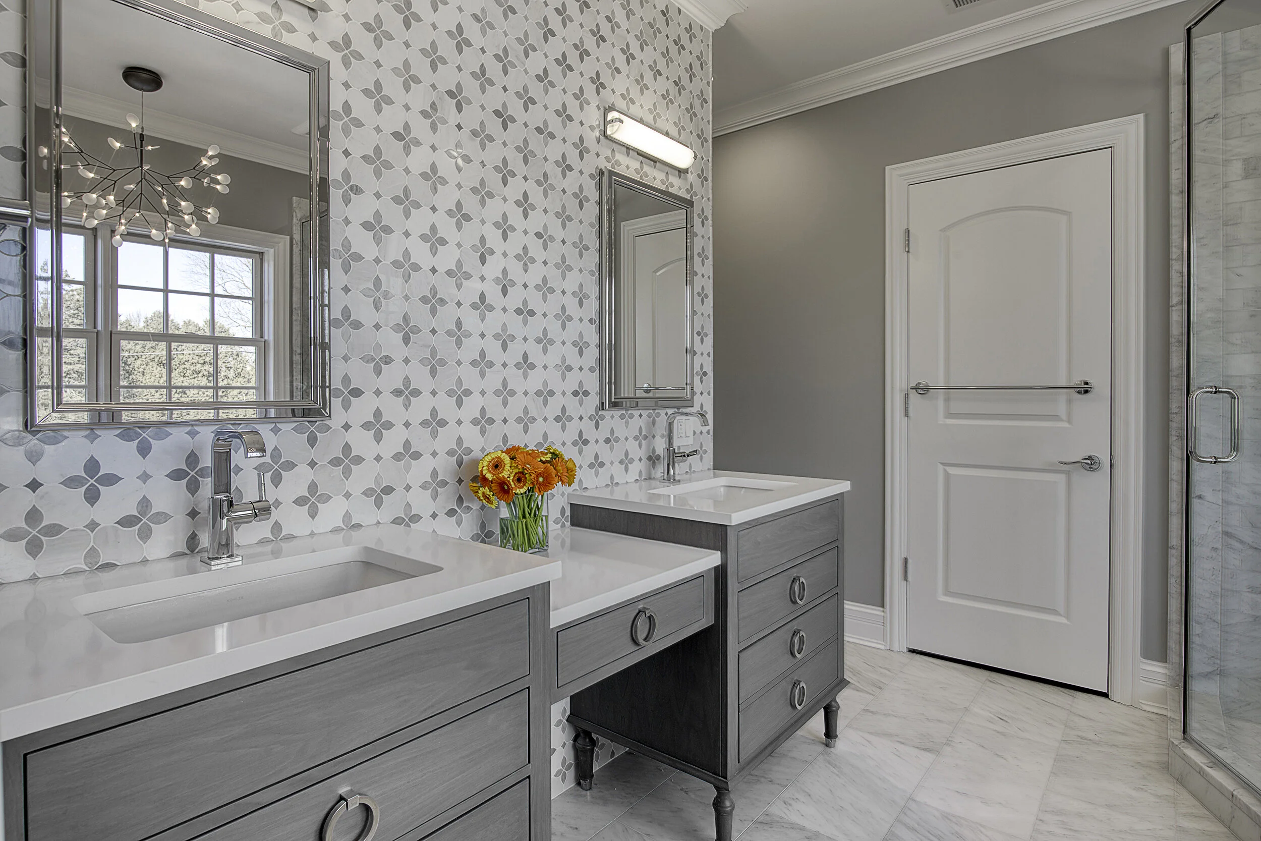
The new master bath features a Furniture Guild Hayden vanity with polished chrome feet and Grohe Allure faucets against a Carrara and Bardiglio patterned marble wall.

The new master bath features a Furniture Guild Hayden vanity with polished chrome feet and Grohe Allure faucets against a Carrara and Bardiglio patterned marble wall.

We lived through the All-Brown Home Era, and we don’t mourn its passing. Other colors seemed to disappear in a brown eclipse. It has a muddy effect when it is the dominant look from top to bottom in a home. We think browns often work best when used selectively as a special piece or in custom cabinetry. More broadly, browns can also work in rooms with ample natural light and when paired with other adventurous choices in color and pattern, from art work to furnishings.

The former bathroom was a classic example of “Builder-Grade Brown” from 2008. Bathrooms are usually not the best environments for for a brown-dominant color scheme.

The former bathroom was a classic example of “Builder-Grade Brown” from 2008. Bathrooms are usually not the best environments for for a brown-dominant color scheme.

Furniture feet and elimination of the old storage tower between the two vanities had a slimming effect by removing some of the visual mass in the bathroom. Another good result was improved storage.

Furniture feet and elimination of the old storage tower between the two vanities had a slimming effect by removing some of the visual mass in the bathroom. Another good result was improved storage.

In the new bathroom, a free-standing Hydrosystems tub sits on a heated floor and under the organic shape of the Moooi light fixture.

In the new bathroom, a free-standing Hydrosystems tub sits on a heated floor and under the organic shape of the Moooi light fixture.

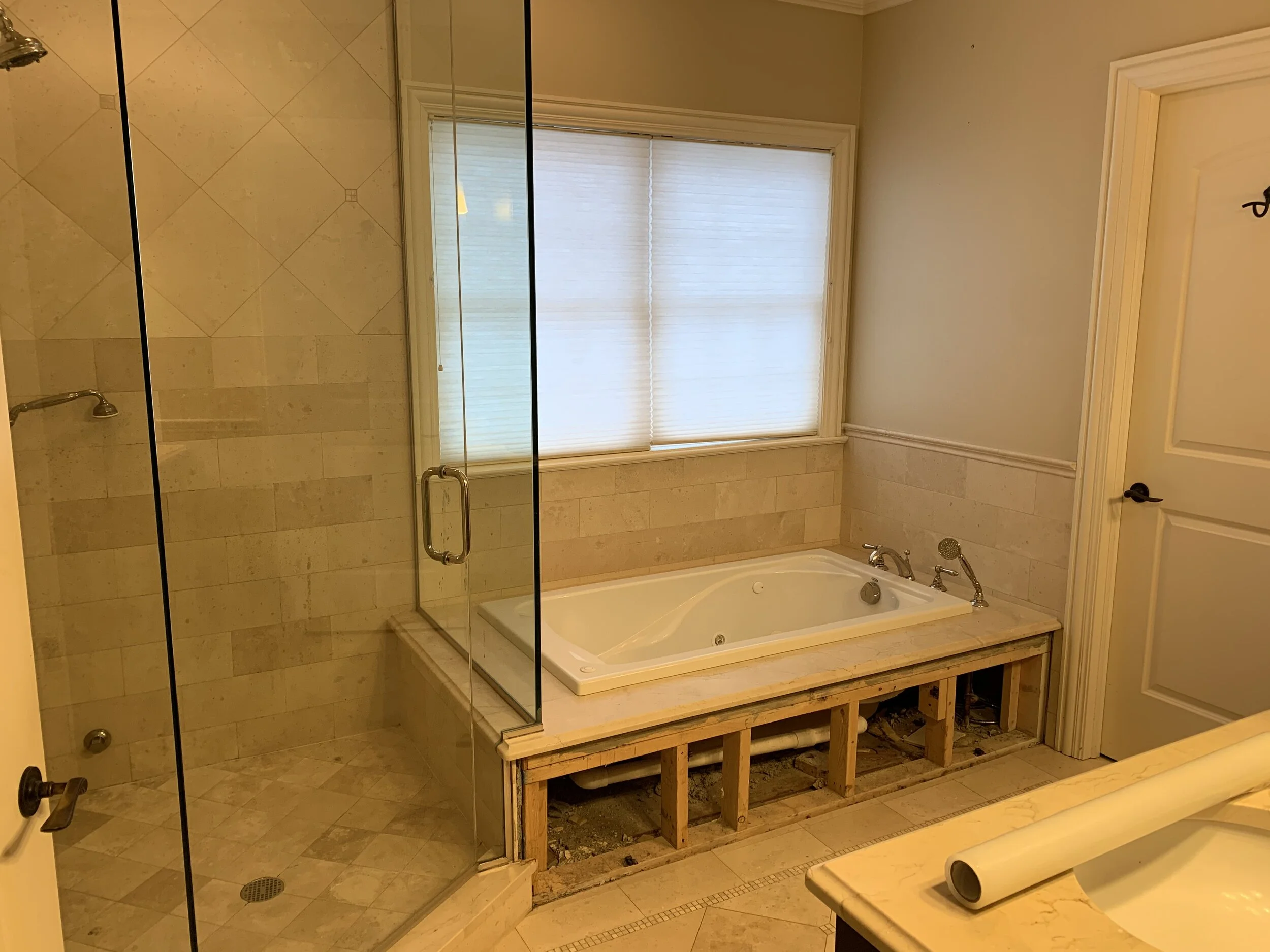
The old shower lacked a bench, but it featured four different sizes of square Crema Marfil tile for maximum brown impact. The jacuzzi tub was rarely used.

The old shower lacked a bench, but it featured four different sizes of square Crema Marfil tile for maximum brown impact. The jacuzzi tub was rarely used.

We have reservations about an all-brown bathroom, and our clients shared them. The new bathroom traded a dour brown color palette for a lighter presentation with fetching lighting, custom vanity, and a complementary marble pattern. It was a pleasure working with them on Project Brownout!
Bathroom Series, 2 of 3

Following our version of a neo-classical hall bath in Bathroom Series, 1 of 3, we now present a bathroom with a distinctly modern style.

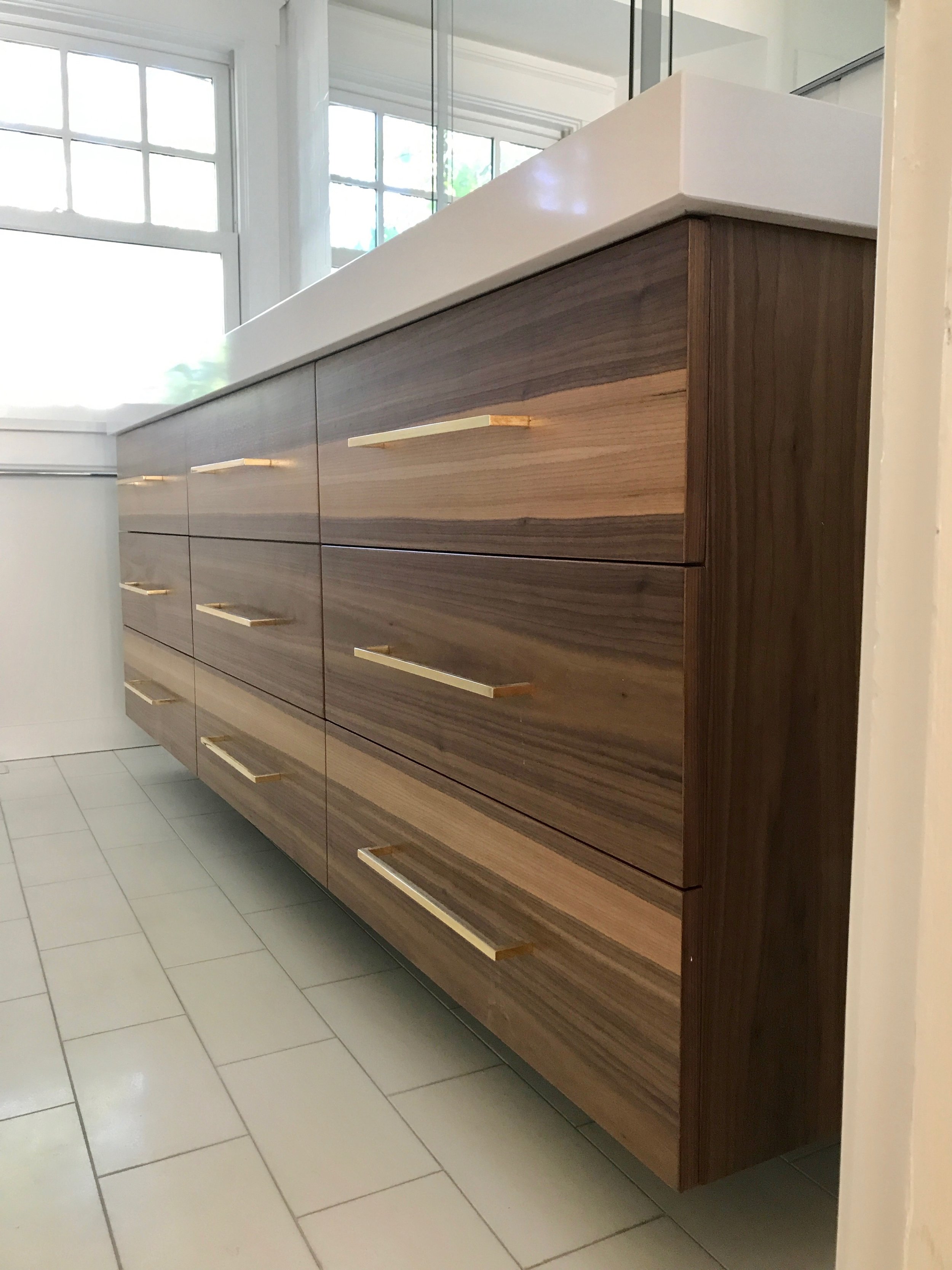
We admit we're entranced by this sleek centerpiece from Furniture Guild. Behold an 84" floating vanity made from American walnut with book-matched grain. Remain composed.

Mmm-hmm. You're all rich wood grain, loooong lines, and sharply dressed. Mighty handsome, if we can say so in a non-weird way. It doesn't sound weird when we say it, right? No shame in your game, Mighty Handsome.

Mmm-hmm. You're all rich wood grain, loooong lines, and sharply dressed. Mighty handsome, if we can say so in a non-weird way. It doesn't sound weird when we say it, right? No shame in your game, Mighty Handsome.

Would you mind if we let our eyes linger a little longer on you? Oh, behave.

Outfitted with solid brass pulls and suspended over Thassos white marble, we used steel braces to keep it firmly mounted on the wall. It's mass appears to be levitating over the floor.    

Outfitted with solid brass pulls and suspended over Thassos white marble, we used steel braces to keep it firmly mounted on the wall. It's mass appears to be levitating over the floor.    

The middle section was designed for extra depth to hold bath towels. All drawers are functional.

The middle section was designed for extra depth to hold bath towels. All drawers are functional.

Faucets made in Brooklyn by Watermark and medicine cabinets from Robern. Tile from Ann Sacks. The 7 cm profile of Casesarstone white quartz complements the modern aesthetic.  

Faucets made in Brooklyn by Watermark and medicine cabinets from Robern. Tile from Ann Sacks. The 7 cm profile of Casesarstone white quartz complements the modern aesthetic.  

Three recessed medicine cabinets add useful above-sink storage for the owners. This version comes with integrated lighting, an electrical outlet, and built-in interior lighting to illuminate the inside of the cabinet. It even has a thingy to hang yo…

Three recessed medicine cabinets add useful above-sink storage for the owners. This version comes with integrated lighting, an electrical outlet, and built-in interior lighting to illuminate the inside of the cabinet. It even has a thingy to hang your razor or toothbrush. If you install it, you can call it a thingy.  

The Kelly Wearstler brass-wrapped ceiling light echoes the vanity pulls.  

The Kelly Wearstler brass-wrapped ceiling light echoes the vanity pulls.  

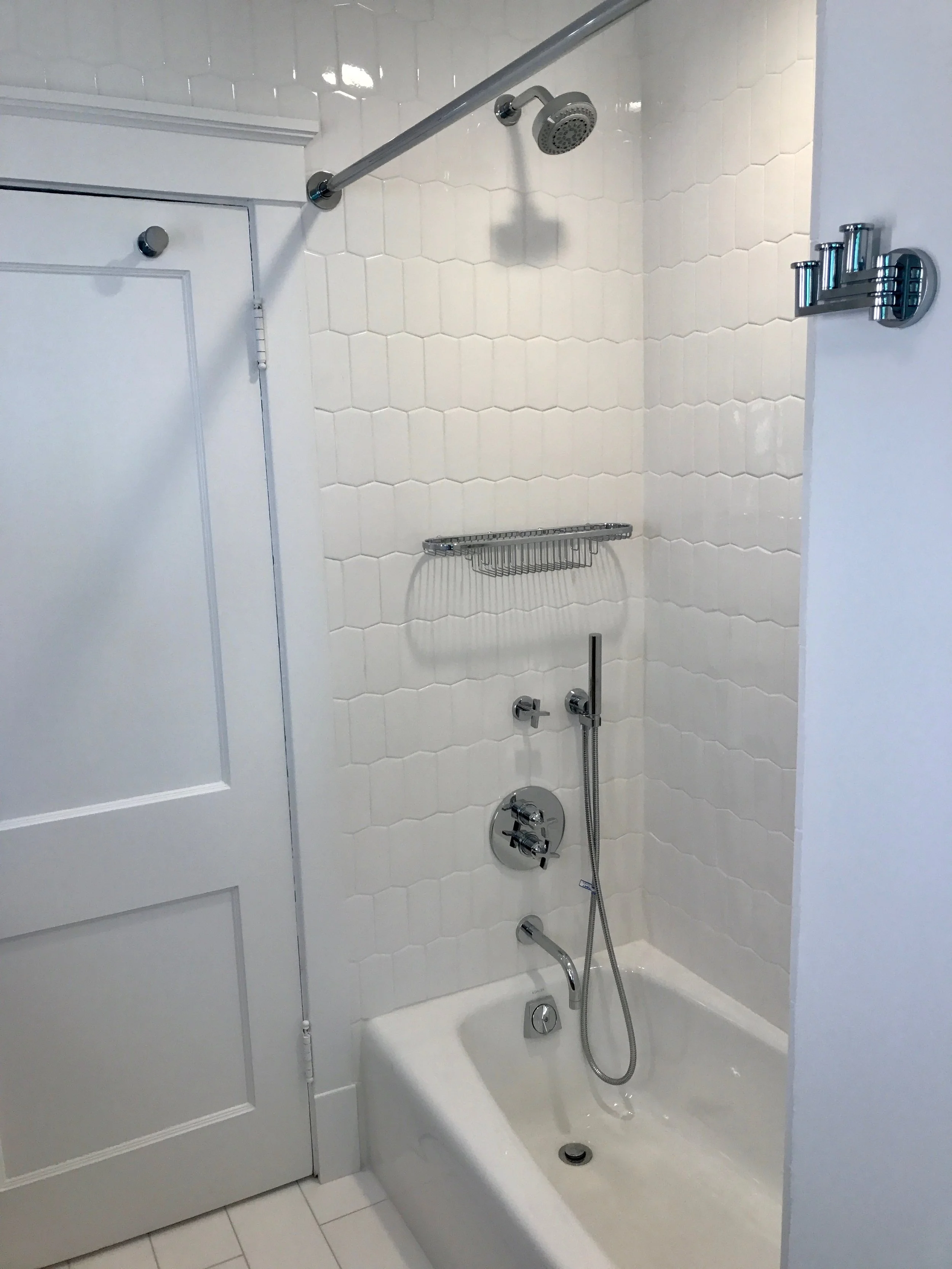
The new tub and shower. All accessories from Ginger.

The new tub and shower. All accessories from Ginger.

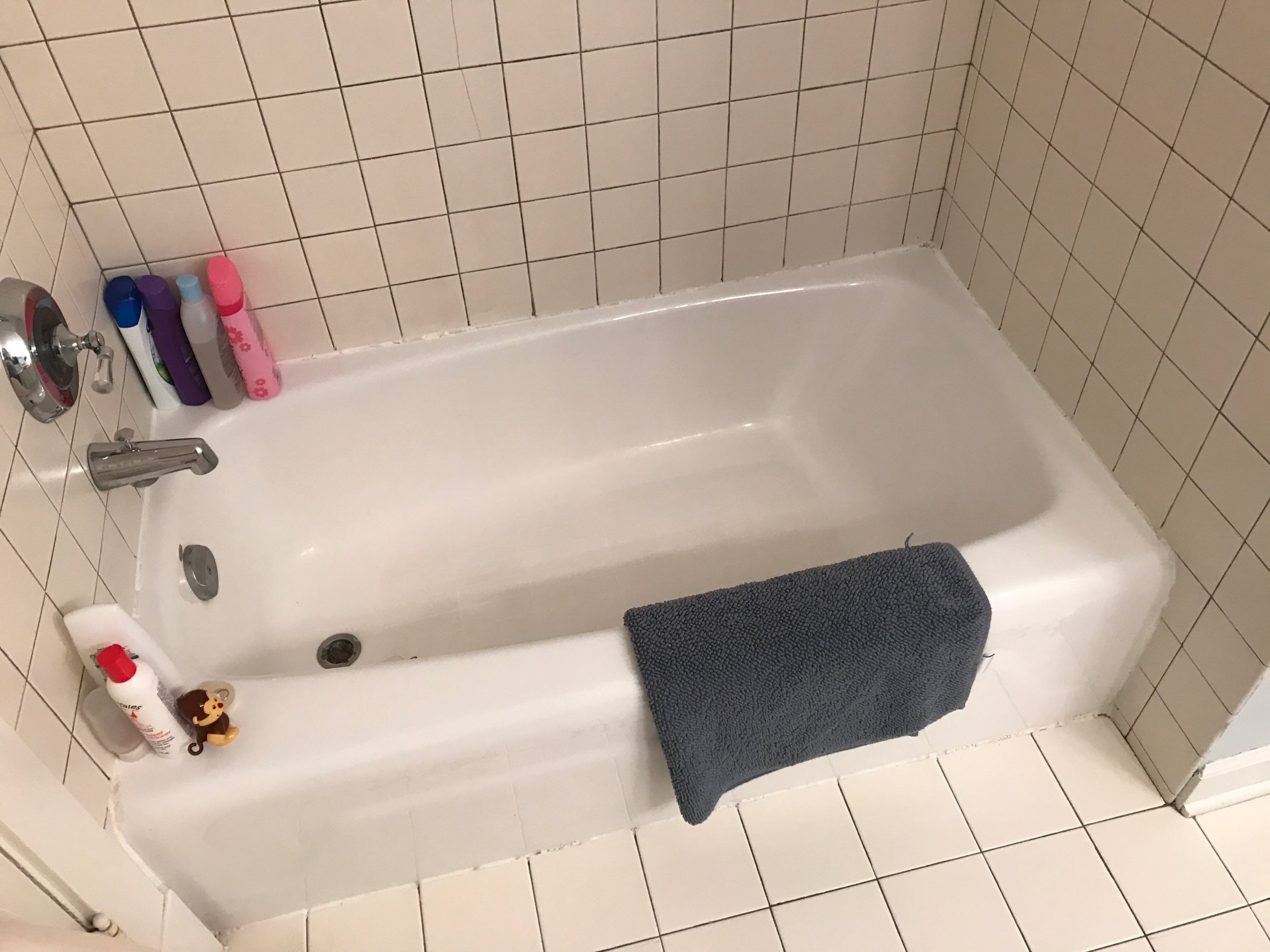
The old tub and shower. Do you recall the abundance of 4x4 white tile from the hall bathroom we featured in Bathroom Series 1 of 3? We'd like to forget that, too.

The old tub and shower. Do you recall the abundance of 4x4 white tile from the hall bathroom we featured in Bathroom Series 1 of 3? We'd like to forget that, too.

Half of the old vanity with surprisingly little useful storage, poor lighting, and no medicine cabinets.

Half of the old vanity with surprisingly little useful storage, poor lighting, and no medicine cabinets.

The other half of the old vanity. A tall linen tower wedged in the corner offered little practical storage and could not be accessed easily. The right hand doors conflicted with light switch and the bathroom door. 

The other half of the old vanity. A tall linen tower wedged in the corner offered little practical storage and could not be accessed easily. The right hand doors conflicted with light switch and the bathroom door. 

Mighty Handsome is also a good example of luxury within limits. One cost-saving feature of this 66 square foot bathroom is that we did not expand the existing footprint. Another is that we did not have to relocate the plumbing. We're thrilled our clients gave us the opportunity to execute this modern vision, and Mighty Handsome will long remain dear to our hearts.     

Remodeling and Home Design