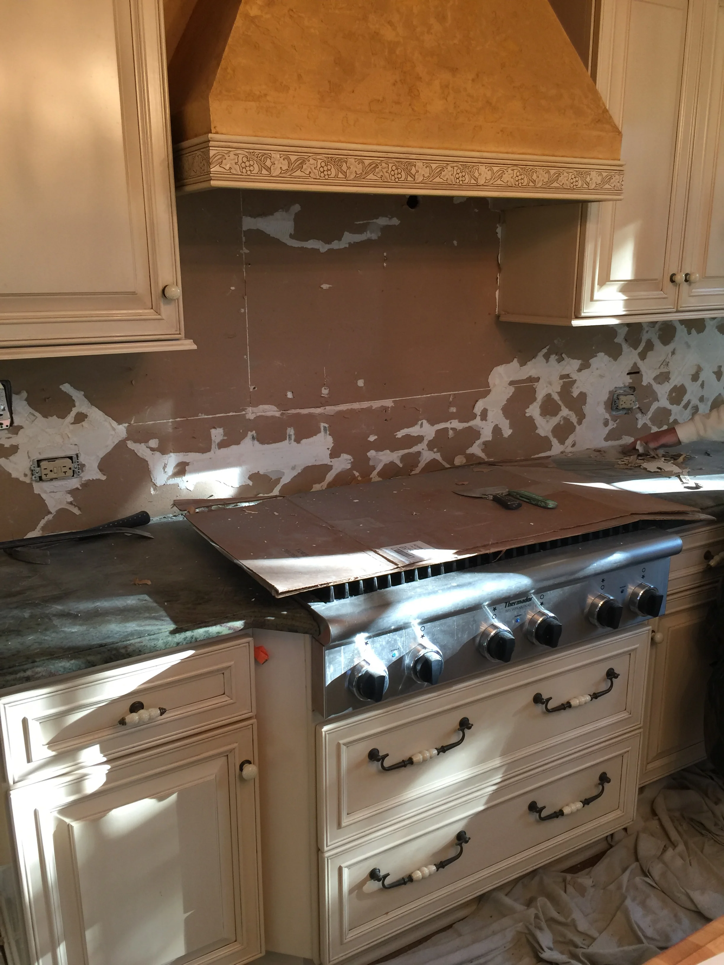
We mentioned that some projects are best suited for restraint in "Let's Not Screw This Up, Shall We?", and this kitchen is a good example of minor construction with outsized results. Our goal was to convert the former owner's ornate style into the kitchen our client wanted without starting over from scratch.
The good news was that it was a candidate for fine-tuning rather than a complete overhaul because it already had good quality appliances and cabinetry in place.
The bad news is that the outdated kitchen was defined by an Italianate theme. Heavy-handed design and overt symbolism is the hallmark of these kinds of rooms in which nothing subtle survives. It's one thing when a child is delighted by a superhero-themed bedroom. Hulk it up or go wild with Wonder Woman if you wish. But it's an entirely different thing elsewhere in a home.
In this case, our clients were ready to take Tuscany out of their kitchen. One of the most jarring features was the pumpkin-cinnamon colored texture on the walls. We are not advocates of faux-texturing, and the color did not fit the new plan. In addition, the kitchen included several different surface textures, multiple metals both modern and antique, distinctly green granite on the perimeter, and rustic light fixtures.
It was time to say addio to the Italian kitchen, including the pastoral backsplash over the cooktop.
Here we can see the original kitchen in all of its Tuscan glory: green speckled granite countertops, beige stone backsplash, antique knobs, creamy yellow cabinets, and the old sink faucet next to the window. The color of the textured walls cast the kitchen in an unflattering light.
We removed the pastoral backsplash, cabinet hardware, and countertops. The china cabinet found a new home, and the walls were skim-coated smooth for paint. Cream colored cabinets were targeted for new paint. What to do about the heavily textured mustard-colored range hood?
We clad the hood in wood with a custom stain to match the new shelving near the window. A view of the hood surrounded by new hardware, sink faucet, freshly painted cabinets and walls, Calacatta backsplash, and new countertops.
A view of the refinished island top, new light fixtures, and the shelving unit next to the bay window.
A good spot to enjoy a cup of coffee.
We'll be the first to admit that working with a clean slate is a liberating opportunity. Still, there are good reasons not to get carried away. The typical demolition/rebuild approach can lead to some missed opportunities, unwise expenses, and extended timelines. Demolition is a function of design, and some projects need more scalpel than sledgehammer. We like to think we know the difference.
Something about the the relaxed style of this kitchen feels right to us, and more importantly, to our client. It's a lived-in expression of our clients' preferences. No change was made to the footprint or appliances. No forced theme and no breathtaking budget. As both a working kitchen and an inviting space to gather friends, we're excited for our clients to create many great memories in their new home.


