kitchen

Beyond Builder Grade Part 1

The owners of a relatively young home asked us to update their first floor, and we could see that the style of the home was essentially unchanged since it was built in 2004. We touched every part of the first floor and got the ball rolling with a new kitchen.

A new kitchen in the same footprint. Custom cabinetry, new appliances, and mixed materials refreshed the original kitchen.

The original cream-colored cabinets had yellowed with age. The universal use of dark speckled granite, cabinet knobs in lieu of any cabinet pulls, basic lighting, and brown travertine backsplash were typical builder-grade selections commonly found in homes from this era.

Notice the detail of the original kitchen cabinetry which created a heavy, overly formal kitchen atmosphere. Some describe this as “fancy Shaker” because the classic style has been dressed up with a beaded inset door, brown glaze over the paint finish, and a raised panel. In this picture we can see the raised panel is separating from the stile, an area that is difficult to repair.

We opted for the classic Shaker style which we admire for its versatility and clean lines, all without calling attention to itself. Plays well with other materials, too!

Short cabinetry in the original kitchen created some strange elevations and left a void in the middle that collected odds and ends. We’re not saying that a bar function was calling to us in the updates. But we might have heard a bar function whispering to us in the design process.

A good example of mixed materials at work in the new bar area, and an inviting spot to pour a drink.

The original kitchen suffered from “fancy cabinet syndrome” that was incompatible with the rest of the home and the unfussy style of the owners. Ornamental cabinetry played a large role in dating the kitchen, and the appliances were starting to misbehave as they approached the end of their service life.

We were thrilled to improve the kitchen for our lovely clients, and we hope they enjoy it with family and friends as often as they can.

Stay tuned for more about this project in the next edition!

A Modern Kitchen in a Traditional Home

Where did the time go? It seems like just last week were were basking in the glory of grout fame followed by a hike in the mountains of Montana that left us breathless. As in, we realized our aerobic condition was no match for hiking terrain at altitude. Later, one of our projects was mentioned in The Spruce July edition.

Note to self: if you drag your junk up a mountain range, it pays to be in shape. Your glutes will thank you later.

Note to self: if you drag your junk up a mountain range, it pays to be in shape. Your glutes will thank you later.

Back at sea level, we completed a small modern kitchen in a traditional home built in 1925. This three bedroom home had been renovated in 2004, but the current owner and avid cook wanted to improve the kitchen for his daily use and frequent entertaining. We’ll start with the “before” pics to set the scene.

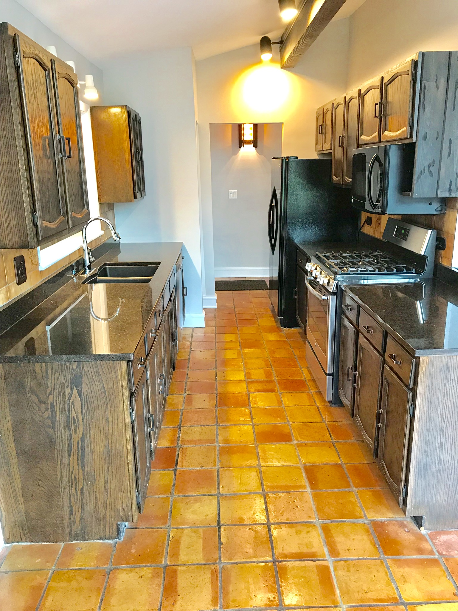
We love a good challenge! The previous kitchen was tightly packed, featured stock cabinetry with dark wood tones, upper cabinetry placed at different heights, terra cotta tile on the floor, malfunctioning cooking appliances at the end of their service life, and little organized storage.

We love a good challenge! The previous kitchen was tightly packed, featured stock cabinetry with dark wood tones, upper cabinetry placed at different heights, terra cotta tile on the floor, malfunctioning cooking appliances at the end of their service life, and little organized storage.

A handful of new kitchens can successfully incorporate an authentic heirloom or an antique on occasion.  This kitchen included a new freestanding cabinet that was distressed to appear old. We call this “fake old” because it’s a modern counterfeit.  Unfortunately, in this instance, it was intended to hide problems with stock cabinetry and unresolved layout problems.

A handful of new kitchens can successfully incorporate an authentic heirloom or an antique on occasion. This kitchen included a new freestanding cabinet that was distressed to appear old. We call this “fake old” because it’s a modern counterfeit. Unfortunately, in this instance, it was intended to hide problems with stock cabinetry and unresolved layout problems.

The new kitchen features sleek new cabinetry, improved lighting and appliances, and a simplified design in the same compact footprint. There is no rule that says traditional kitchens must be placed in old homes. In fact, we appreciated the opportunity to break from conventional expectations in this kitchen.

The new kitchen features sleek new cabinetry, improved lighting and appliances, and a simplified design in the same compact footprint. There is no rule that says traditional kitchens must be placed in old homes. In fact, we appreciated the opportunity to break from conventional expectations in this kitchen.

A large single-bowl SmartStation from Julien replaced the old double bowl sink, and the new quartz countertops will handle heavy use in this kitchen.

A large single-bowl SmartStation from Julien replaced the old double bowl sink, and the new quartz countertops will handle heavy use in this kitchen.

A powerful range offers high BTU burners, convection and steam cooking functions, and a warming drawer. We are fans of the matte black mosaic backsplash, and the star pattern was subtly restrained by the charcoal grout.

A powerful range offers high BTU burners, convection and steam cooking functions, and a warming drawer. We are fans of the matte black mosaic backsplash, and the star pattern was subtly restrained by the charcoal grout.

Even 170 square feet can be highly functional and streamlined for a hard-working kitchen. A couple tips for improving a small kitchen: be ruthless when you cut the excess, pay extra attention to the cabinetry internals for enhanced organization, and don’t overlook multiple sources. of lighting. We were happy to update this traditional home without the constraints of a certain historical period, and we hope the owner enjoys many meals and gatherings in the new kitchen!

New Kitchen Plans

We regularly demolish and create new kitchens as part of our design-build practice, and the majority of them have outlived their usefulness by several years or even several decades. Typical complaints include expired appliances, limited storage, outdated styles, damaged cabinetry, and difficult layouts.

Even kitchens built in the last 15-20 years suffer from a variety of drawbacks, and a fair number of common problems can be traced to the kitchen plans. In the example below, we’ll point out some of the limitations we found in a 20 year old kitchen and our planning process as we worked to improve it.

The completed kitchen with custom cabinetry, new appliances, and an extended footprint. One benefit of good quality cabinetry is that it is easier to repair or refinish than cabinetry made with cheaper materials.

The twenty year old kitchen we replaced. Illuminating the ceiling with lights mounted on top of the wall cabinets was one of several curiosities in this kitchen. A 3” tall backsplash is not as useful as a full height backsplash and creates an artificial break under the wall cabinets. Mediocre quality cabinets do not allow for easy repairs or refinishing. Also, mixing yellow wall paint and multiple brown tones in the same space is likely to create a muddy visual best avoided in the kitchen.

A side-by-side view of the new and old kitchens helps illustrate some of the thinking that goes into a new kitchen plan. We started with the main drawbacks of the existing kitchen to set priorities:

  1. The footprint of the old kitchen was limited by two redundant entryways to the right of the peninsula. This meant that the main workspace area near the ovens, sink, dishwasher, microwave, and cooktop was only large enough for one person to work comfortably. By eliminating one of the two entryways, we gained an extra 28” of valuable wall and floor space to enlarge the work area and peninsula without sacrificing the flow to the adjacent dining room.

  2. The location of the appliances led to obstructions, little prep space, and “appliance overload.” The refrigerator and freezer doors would open frequently to block the main passage to the kitchen, and the area next to the refrigerator was a dumping ground for miscellaneous items because it was too far from the major appliances to be useful prep space. Clustering the ovens, cooktop, microwave, dishwasher and sink to led an imbalanced kitchen that was overweighted on one side. By moving the refrigerator and relocating the cooktop and oven to the opposite wall, we created a more balanced kitchen, removed an obstacle to the main passage, and created more useful prep space.

  3. The peninsula was not deep enough to provide practical seating for casual meals. Adding depth was easy once we extended the length of the kitchen by eliminating one of the two passageways to the dining room.

  4. The number of upper cabinets is worth reviewing in any kitchen re-design. We frequently see efforts to install as many as possible, and this leads to an unnecessary massing of wall cabinetry that adds visual bulk as well as cost to the kitchen budget. Importantly, we believe a kitchen should have well-designed storage which tends to alleviate cabinetry bloat. Think good storage vs. more storage. Wall cabinets are naturally too high for easy access beyond the first or second shelf. We eliminated some wall cabinets and emphasized the storage capacity of the base cabinets, including a pantry with rollout shelves for easy access.

A view of the Berlin honed quartzite countertops and cooktop placement. One key is a hood vent that provides sufficient air movement and exhaust to the exterior of the house. A microwave over the cooking surface is not adequate ventilation for much more than making mac-n-cheese. Quartzite is a durable material for kitchen counters, and Berlin features a charcoal grey color with subtle white veining.

Introducing one bank of open shelving helps limit the visual mass while also providing the owner easy access to everyday dishes.

A view of the cooktop wall. Drawers are preferable to doors in this location for convenient access to pots, pans, and cooking utensils. Although there was enough space for one more wall cabinet on either side of the hood vent, it would have added visual clutter without adding much usable storage.

A good kitchen plan is a highly important part of a kitchen renovation because it accommodates different budgets, multiple styles and family sizes, and it gives the owners the best chance of success in accomplishing their goals. Time spent planning is incredibly valuable. We thank these busy professionals for dedicating the time to work on the plan during evenings and weekends with us, and we hope they enjoy their new kitchen every day!

Kitchen Series, 3 of 3

We demolished and rebuilt a small rectangular kitchen in our last installment of the Kitchen Series. Today we have a 1956 galley kitchen that stretches the rectangle—but it is even more narrow than the 1943 version in Kitchen Series, 2 of 3. The evolution of kitchens across the decades shows many developments. Much of the functionality remains the same, but the materials and the idea of the kitchen has undergone major changes.

The new kitchen with sleek grey and white semi-custom cabinets, hardwood floors, and high-end appliances.

The new kitchen with sleek grey and white semi-custom cabinets, hardwood floors, and high-end appliances.

Advice from Mom: if you can’t think of something nice to say, don’t say anything at all. A tall ceiling and adjacent natural light were the best features of this kitchen before we started.

Advice from Mom: if you can’t think of something nice to say, don’t say anything at all. A tall ceiling and adjacent natural light were the best features of this kitchen before we started.

Typical galley kitchens are out of favor because they are often outdated and too cramped for entertaining. Open kitchen plans are more popular than ever. However, any kitchen footprint can work well if other requirements are met—including galley kitchens. One valuable guideline is to avoid overwhelming the space with materials. Focus on the essentials and apply the editor’s maxim: have “the guts to cut” anything unnecessary. Think Hemingway, not Faulkner, in small kitchen design.

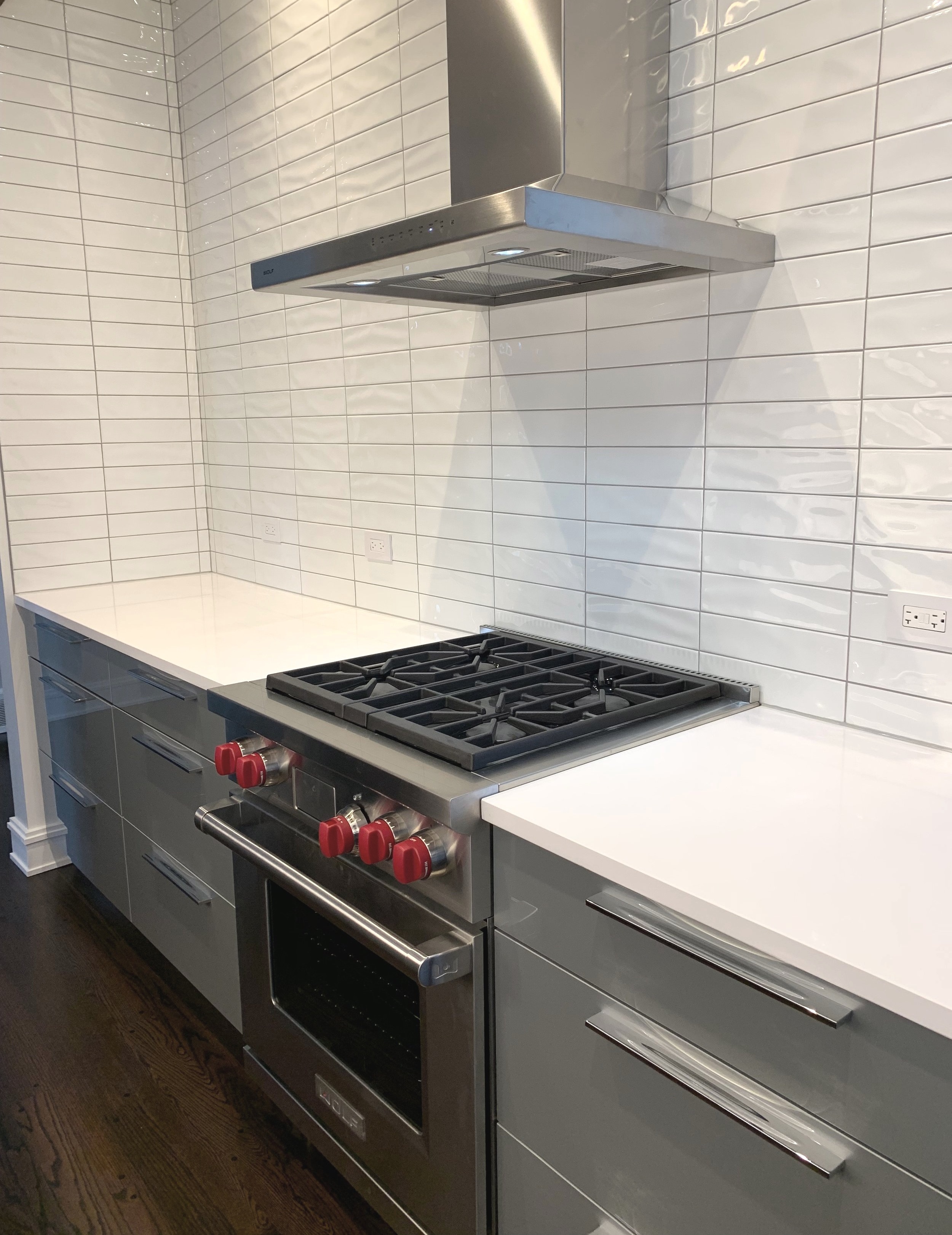
A view of the Wolf dual-fuel range and backsplash to the ceiling with undulated tile. No upper cabinets clutter the space. Generous organized storage under the counter was sufficient for these clients.

A view of the Wolf dual-fuel range and backsplash to the ceiling with undulated tile. No upper cabinets clutter the space. Generous organized storage under the counter was sufficient for these clients.

These clients subscribe to the “less is more” approach to kitchen design, and we agree. Numerous kitchens suffer from too many ornamental details (intricate cabinet doors, for example, to create the illusion of something “historic” or fancy) or over-styled finishes (hand-painted Italianate tile was popular at one time). Excess competes for your attention and ages quickly, too. Simplicity is not the same as plain.

Wolf drawer microwave under white quartz countertops, Franke water filter, and Sub-Zero refrigerator shown above.

Wolf drawer microwave under white quartz countertops, Franke water filter, and Sub-Zero refrigerator shown above.

This kitchen reminds us of the contemporary master bathroom we completed with the emphasis on uncluttered design, high-quality materials, and our focus on the short list of essentials for our clients. Do you know that feeling when you (pardon the expression) hit the nail on the head at work? We did here. It was a pleasure working with these clients, and it means a lot to us that they are thrilled with their new kitchen.


Remodeling and Home Design